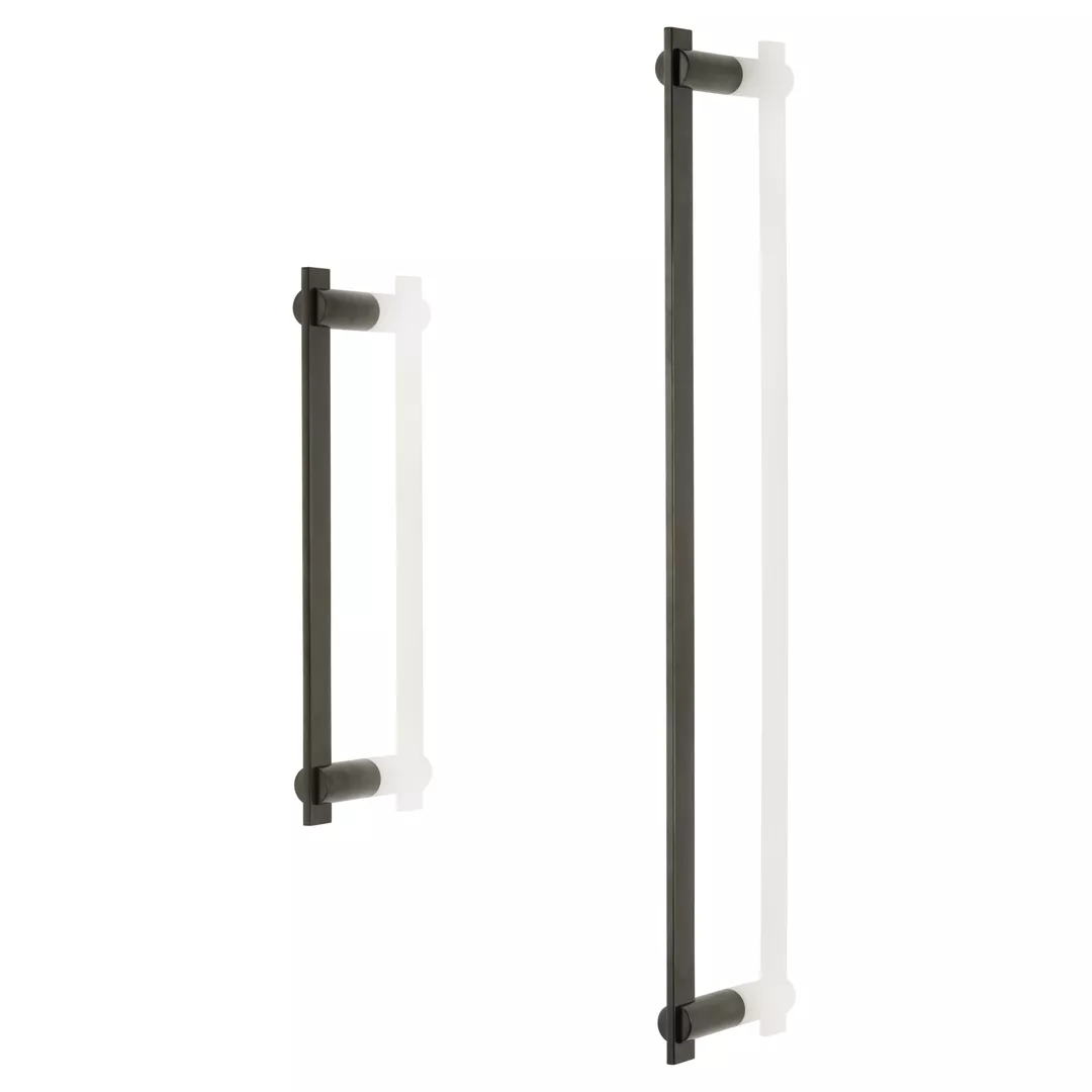
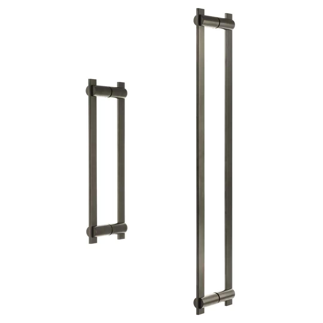
DP1002.SGL
Bailey
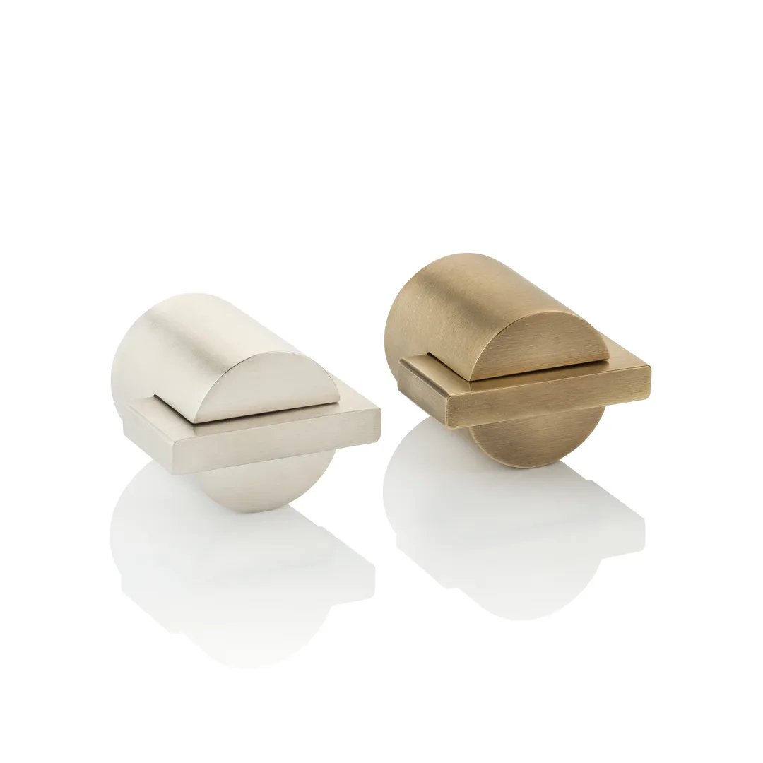
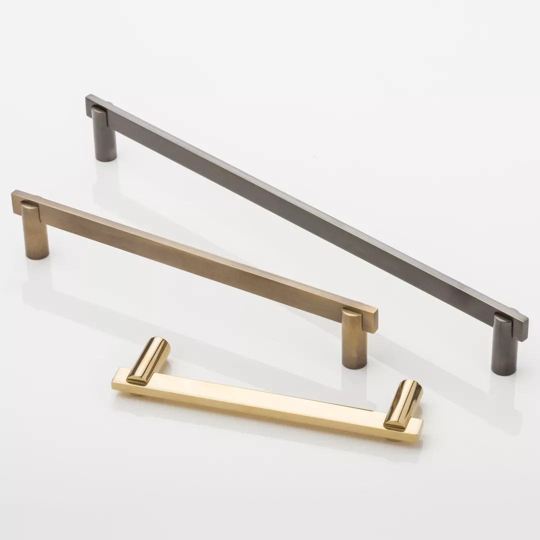
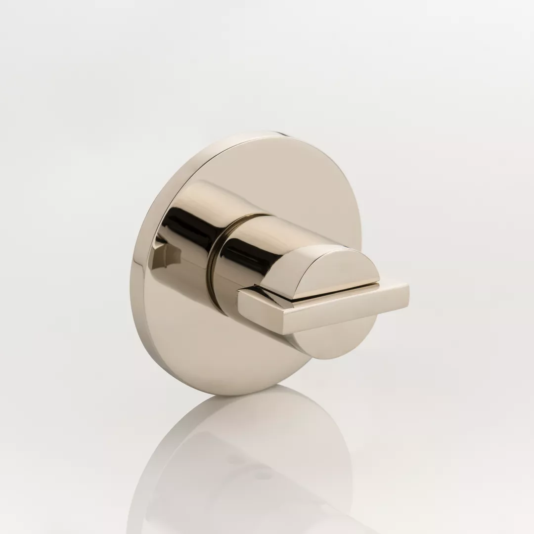
Bailey is inspired by contemporary shapes, and the way in which round and rectangular shapes complement each other.
The Bailey design demonstrates a perfect balance of form and function; the overall look is delicate whilst the functionality is reassuring and solid. One of our sources of inspiration was the London Underground logo, dubbed the 'roundel', which employs the same combination of shapes.

TT1099
Bailey Thumb Turn- Minimalist Rose
CH1002
Bailey Cabinet Handle
DP1002.PR
Bailey Pair of Door Pulls
TT1066
Bailey Thumb Turn
Contact Us
